Car subscription

Car subscription

:Dribe

:Dribe

:Dribe

Client

:Dribe

Deliverables

UX / UI design

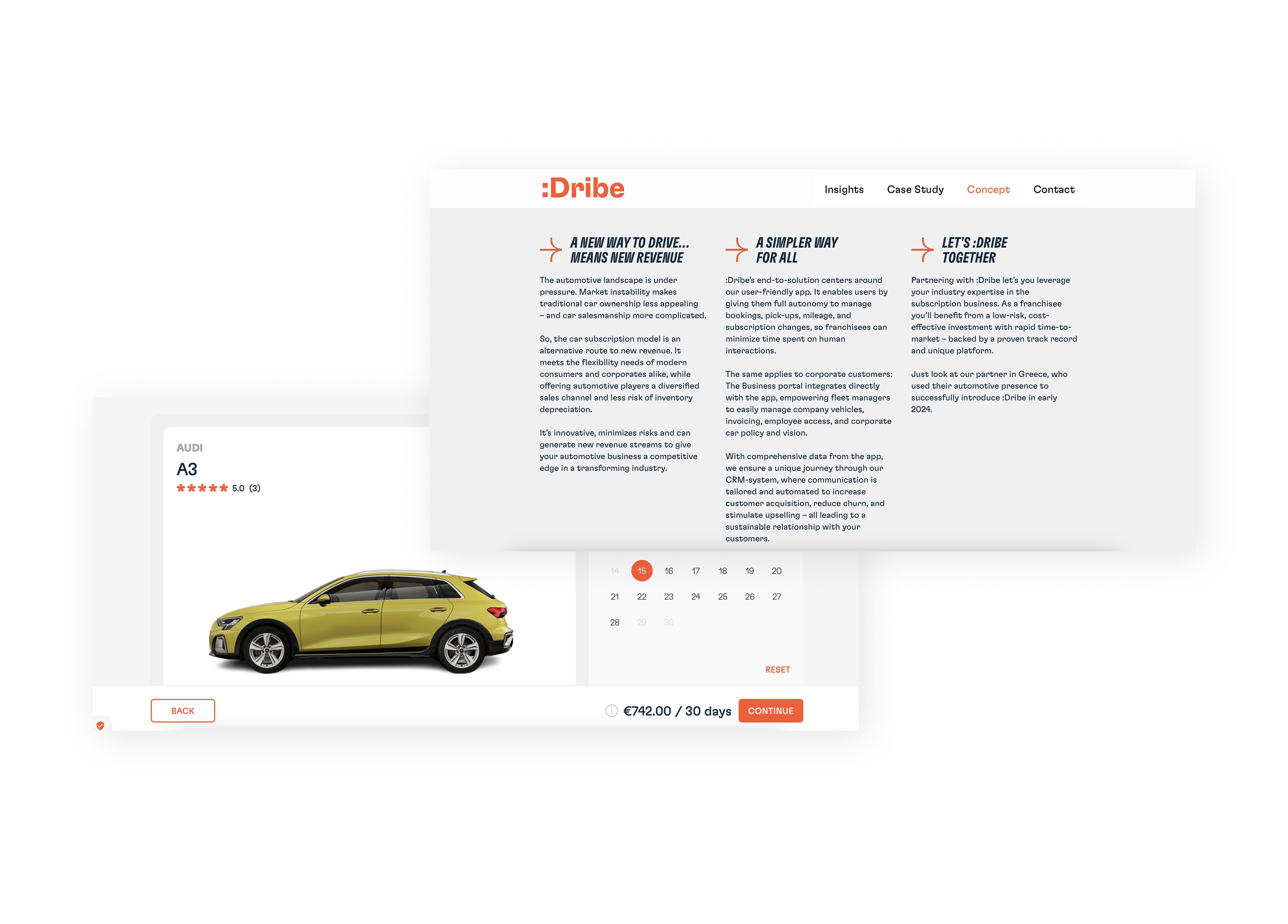
:Dribe was a digital car subscription service that lets customers find and subscribe to a car through an app.

As a UX/UI Designer, I worked across both the B2C and B2B products, contributing to the experience from early exploration and user flows through to final interface design.

Challenge
Subscribing to a car means users have to provide information and make several decisions before completing the process. That made the signup journey especially important, we needed to collect the necessary information while keeping the experience clear and easy to move through. The challenge was understanding where friction was happening and how to simplify the journey without cutting information users needed to decide with confidence. Exploring the problem I took part in a design sprint where we mapped the journey, identified friction points and explored different ways of structuring the flow. Rather than jumping straight into high fidelity designs, we worked through ideas and wireframes first, focusing on what information users needed, when they needed it, and how each step should lead into the next. Testing before refining We tested the wireframes with users to see how they actually moved through the proposed experience. Their feedback showed us where the journey was clear and where people still ran into friction, insights that fed back into refining the flow before detailed interface design. Test, learn, iterate, refine. That gave us a stronger foundation for the final experience, shaped by user behaviour rather than assumptions.

Subscribing to a car means users have to provide information and make several decisions before completing the process. That made the signup journey especially important, we needed to collect the necessary information while keeping the experience clear and easy to move through. The challenge was understanding where friction was happening and how to simplify the journey without cutting information users needed to decide with confidence. Exploring the problem I took part in a design sprint where we mapped the journey, identified friction points and explored different ways of structuring the flow. Rather than jumping straight into high fidelity designs, we worked through ideas and wireframes first, focusing on what information users needed, when they needed it, and how each step should lead into the next. Testing before refining We tested the wireframes with users to see how they actually moved through the proposed experience. Their feedback showed us where the journey was clear and where people still ran into friction, insights that fed back into refining the flow before detailed interface design. Test, learn, iterate, refine. That gave us a stronger foundation for the final experience, shaped by user behaviour rather than assumptions.

Subscribing to a car means users have to provide information and make several decisions before completing the process. That made the signup journey especially important, we needed to collect the necessary information while keeping the experience clear and easy to move through. The challenge was understanding where friction was happening and how to simplify the journey without cutting information users needed to decide with confidence. Exploring the problem I took part in a design sprint where we mapped the journey, identified friction points and explored different ways of structuring the flow. Rather than jumping straight into high fidelity designs, we worked through ideas and wireframes first, focusing on what information users needed, when they needed it, and how each step should lead into the next. Testing before refining We tested the wireframes with users to see how they actually moved through the proposed experience. Their feedback showed us where the journey was clear and where people still ran into friction, insights that fed back into refining the flow before detailed interface design. Test, learn, iterate, refine. That gave us a stronger foundation for the final experience, shaped by user behaviour rather than assumptions.

Before and after

Solution

Designing the experience

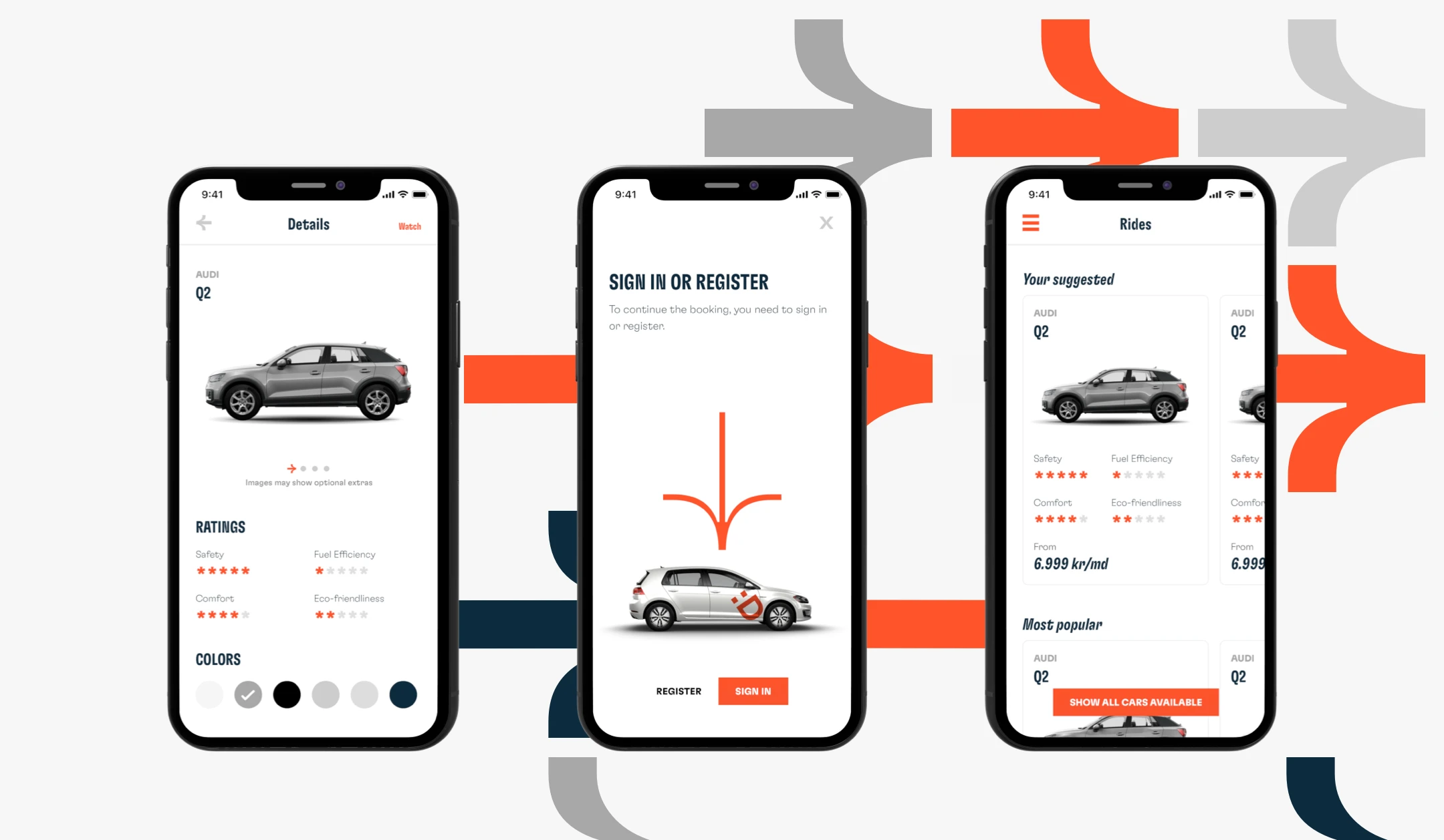
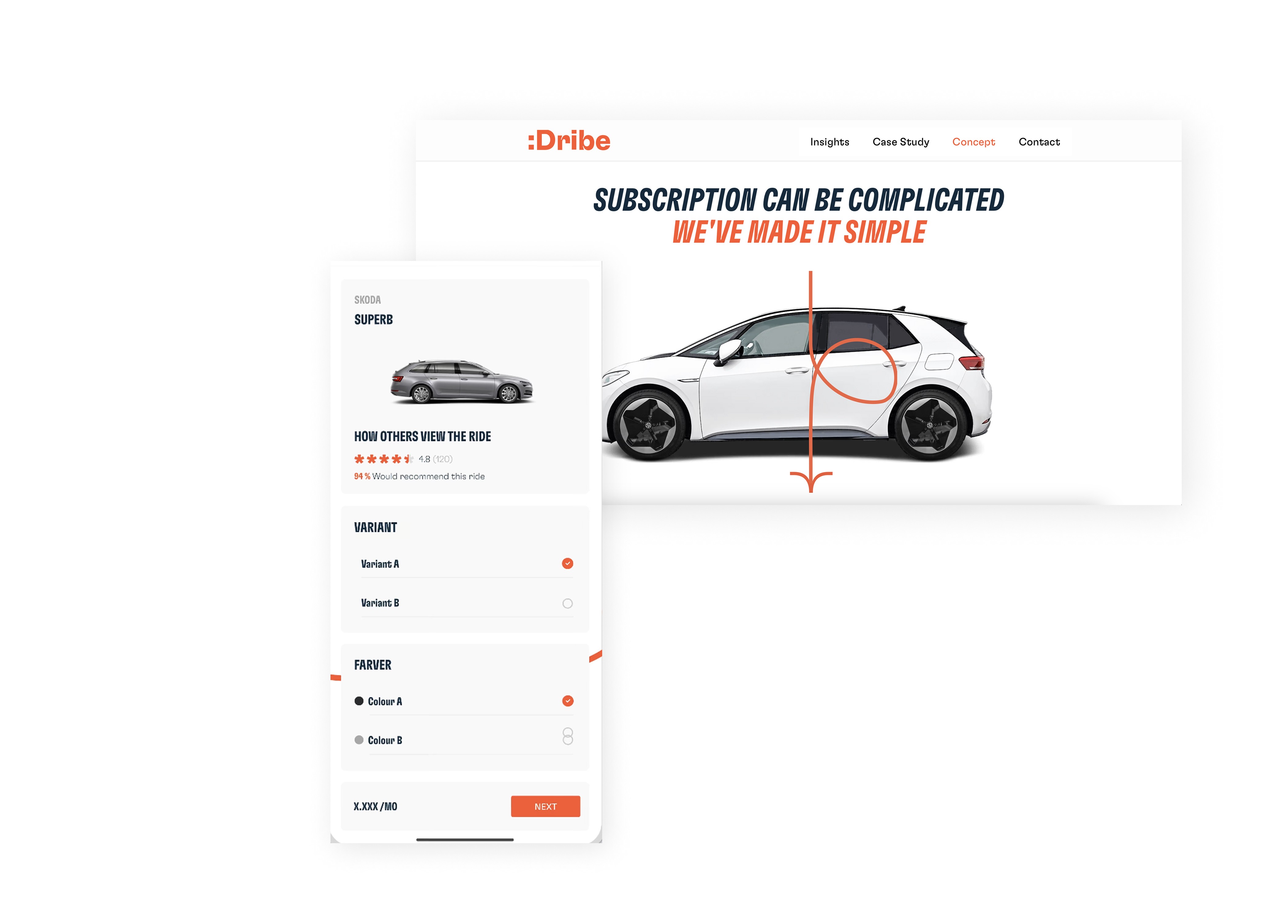
Based on what we learned, I helped translate the updated journey into a clear and consistent interface, reducing unnecessary complexity through clear visual hierarchy, focused actions, understandable steps, consistent interaction patterns and clear feedback throughout. The goal was to make a process that could easily feel complex, feel progressive and manageable instead.

Creating consistency across products

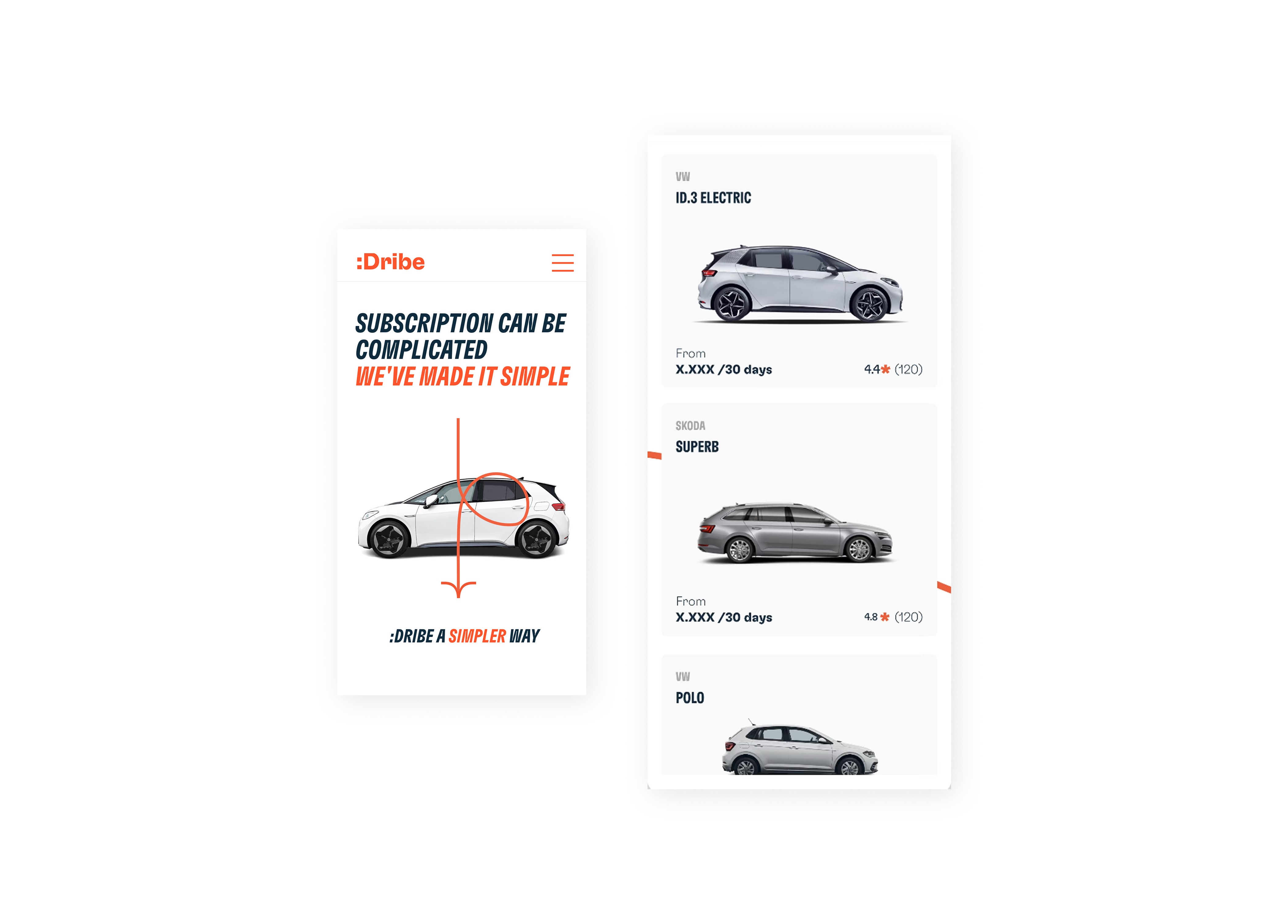
At the same time, :Dribe was introducing an updated visual identity. I worked on translating that direction into the digital product, keeping the experience consistent across the B2C app, B2B product and website, treating the rebrand as an opportunity to build a more cohesive product experience across touchpoints, not just a visual update.

Impact

The project resulted in a more structured signup experience and a more consistent visual and interaction language across :Dribe's digital products.

More importantly, it reinforced an approach I still use today: understand the problem first, explore and test ideas early, and let those insights guide the final interface rather than starting with the UI.
Discover more — dive into my next project
SITE CONTENT © CAMILA AREVALO
ALL RIGHTS RESERVED
SITE CONTENT © CAMILA AREVALO RIGHTS RESERVED